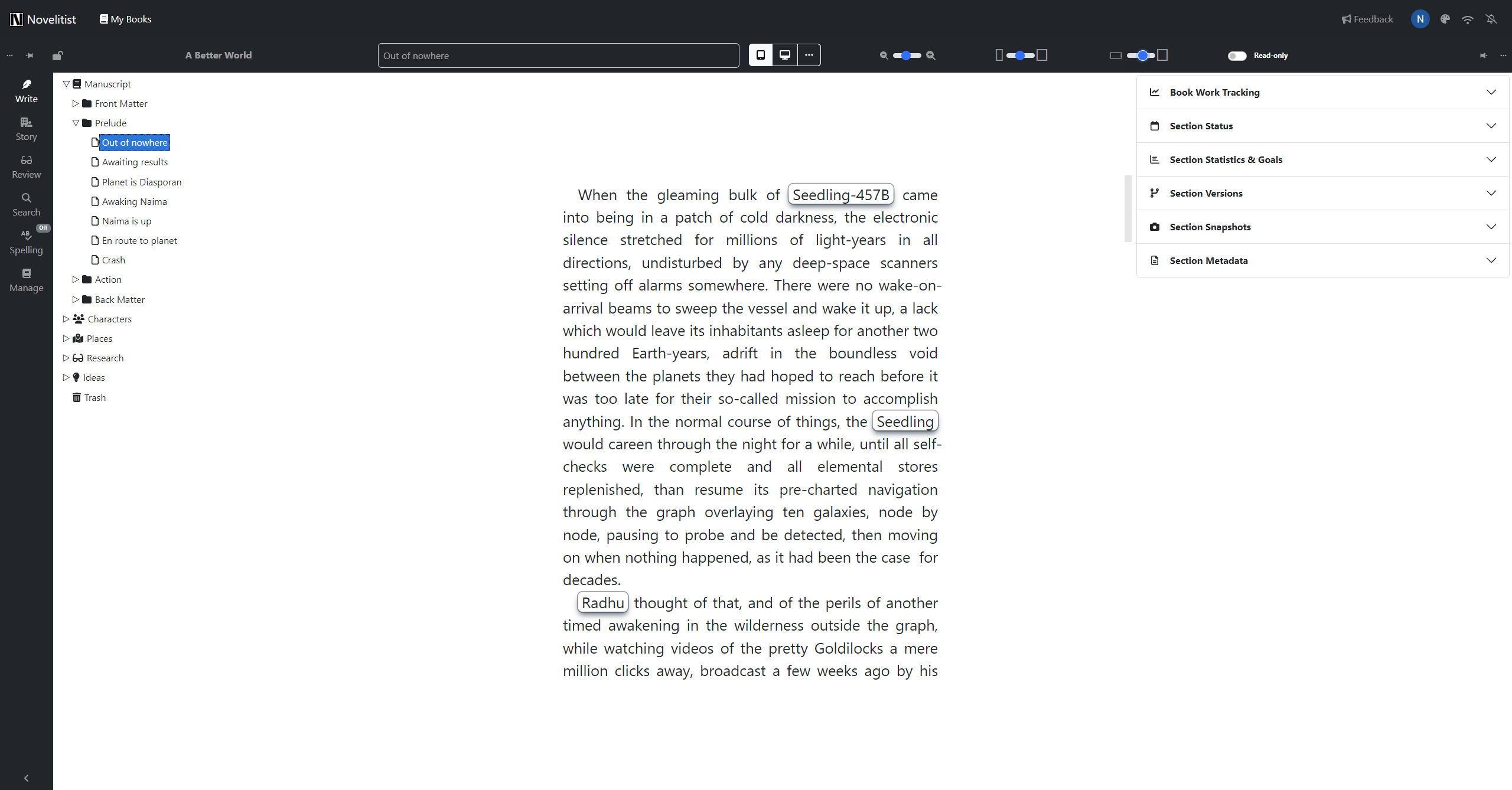
The editor
Novelitist uses a full-featured rich text editor, which allows authoring of material ranging from bare text to rich media content. This is so because we aim to serve writers who publish on different media, including the web.
This editor was developed by writers, with writers, and for writers*. Beyond the obvious and well-known rich content controls (bold, italic, underline, image, table, etc.), the Novelitist editor offers some benefits that will be important to many writers.
As is customary with Novelitist, keeping things simple or going full throttle is a matter of your choice, not an app limitation.
The editor zoom
You can zoom the editor content proportionally without actually altering the font size. If you like to work on big, clearly visible text, you'll find this quite a boon. You can also zoom out to the limit of legibility, just to get a bird's eye view of the overall layout. This setting is saved on a per-book basis.
The editor width
Make the editor narrower or wider, according to your preference. In combination with the editor zoom, this allows you to hit that perfect character count per line, which seems to be anywhere between 45-75 characters. Setting the text zoom and width to your liking ensures the optimal writing experience, tailored specifically to you—by you. This setting is saved on a per-book basis.
The editor height
You can also set the editor height, in the same way. This may be useful especially on large screens, in Distraction-free mode, to make the text you’re working on as center-screen as possible.
Paragraph style
This is another of those seemingly innocuous things that can actually get quite annoying for some people. For practical purposes, there are two main defaults to align a paragraph text: left-aligned or justified.
The difference is that the left-alignment distributes the white space between words equally, which results in a variable tail of white space at the end of each line, while justified text has no white space at the end of each line, but instead distributes all that white space between the words in that line, in an inevitably unequal fashion, which moves the irregularity of the right margin into the body of text.
Traditionally, physical book text is justified (something that has been transferred to e-books, too), due to the possibilities of physical typography, while screen text is left-aligned (like this very document you are reading in a browser of your screen).
In addition, traditional book paragraphs are not separated by any empty space, while the screen paragraphs are. Another difference: (e-)book style paragraphs have an indented first line, whereas web paragraphs don't.
Of course, there are no hard and fast rules, so you can do what you like while you write your book. You get to select which paragraph style you work with while writing, to closely reproduce the final look of the published work.
This setting is saved on a per-book basis.
NOTE: The published book does not take this setting into account. If you publish as e-book, it will have book-style paragraph (justified, no vertical spacing), if you publish as HTML, you'll get web paragraphs (left-aligned, vertically spaced). E-readers will override this anyway according to user preference.
Zoom, width, height, paragraphs—all together
Using these settings together, you can adjust the editor exactly the way you like it! Your editor is never going to be too wide, or too narrow (on both the horizontal and the vertical), or the font too small for your eyes.

Monospace or variable-width font
If you like the typewriter-style text while you write, you can set the editor to use a monospace font.
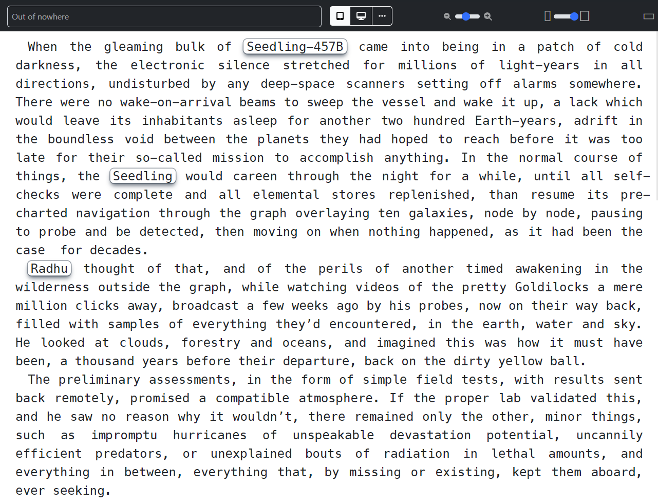
In the next image, the editor uses a monospace font, meaning each and every letter has the same width. This looks like what you'd get with an old typewriter.
The monospace looks more monotonous, more uniform, less distracting. Appears airier, but at the same time angular, colder. The same text wraps into more lines, since most lines are longer—there are no "savings" with narrower letters, since they're all the same width.

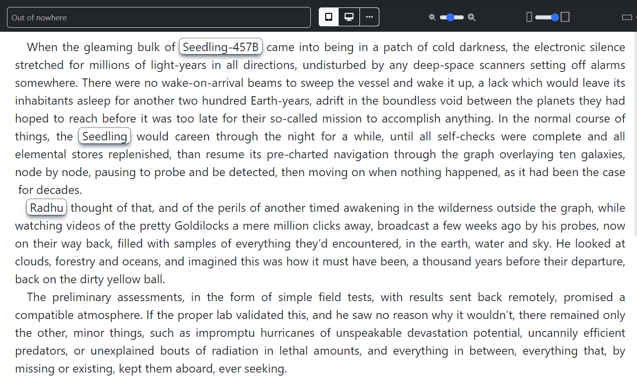
In the image below, the editor uses a "normal", modern, variable-width font. It seems a tad less organized by comparison, but it looks more familiar and perhaps friendlier, since it's the font in which you normally read.

The difference may be subtle, but crucial.
The minimalism of monospace, arising from its uniformity, can be great for writing, yet writing with a variable-width font you see the same effect while you write that others will see when they read it.
Either way, it's great to have the option of switching between them while writing, no matter what your preference. And preferences often change with time.
NOTE: This setting only affects the editor. It’s doesn’t affect the book exports.
Read-only mode
This is a simple switch that serves the double role of 1) preventing you to edit your work by mistake while browsing it, and 2) instant preview of the work, as it gets all the editor elements out of the way. Also saved on a per-book basis.
Let's see all some of these features in action, using this very user guide as an example. (Note that this video is now old, and doesn’t reflect the latest editor updates.)
It’s worth noting that all of these editor features are all available in Distraction-free Mode as well and that these settings are saved per book, so you can have different settings across your library.
* No writers were hurt in the process.